Thursday, January 31, 2013

Flying Hummingbird & Stamp-kissing !

Hello everyone,  I hope you are doing well.   It's been such a strange winter this year for us.  A week ago we were into a deep freeze at minus 25 Celsius.  For two days this week it was freezing rain and foggy, then the temperature rose to plus 10.  We haven't seen the sun for ages and we are back below freezing with snow flurries.    

I have a card today featuring another one of Design by Ryn's beautiful Hummingbirds along with two more of her designs.  This makes me dream about summer...

I'm  joining in with the Simon Says Stamp Challenge, the theme this week is Anything Goes !  You can win a $50 shopping spree !  Wouldn't that be fun to chase away the winter blues?


To create the background I started with Impression Obsessions Solid Cover a Card -CC084.  I inked it up with Colorbox Moss Green Pigment Ink and then 'stamp-kissed' using Ryn's Gerbera with Colorbox Harbor Pigment Ink.   Next I sprayed a little Juniper (blue) Glimmermist.   Once dry I over-stamped with Ryn's Leafy Branch and coloured with my Prisma Pencils and distressed the edges.

I stamped Hummingbird 3 on watercolour paper and coloured with my Tombows using a brush & water.  I cut him out and attached as shown.   "Just a note" is from Impression Obsession- B3552

If you have a chance, please drop by Miranda's and Eileen's Blogs, both with lots of inspiration,  who are also on Ryn's Design Team.   Also Ryn's Facebook page is full of ideas using her stamps.

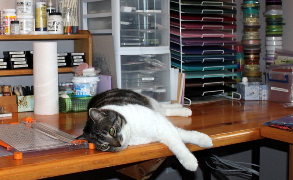
And below is a picture of one of my kitties hanging out with me in my craft room !  I've posted another one of him on my side-bar when he fell asleep.  He is a sweet boy :)


Thanks for your visit !
Have a great day, Shirley

Monday, January 28, 2013

Rococo Baroque Heart

Hello everyone, I hope you are keeping warm !

I have a couple of cards today that feature one of the new Baroque Hearts, newly released clear stamps by Chocolate Baroque.     All four designs are gorgeous and it's hard to pick a favourite.

When I first saw the Rococo Baroque Heart my mind went immediately to a Romantic Victorian style but I wasn't sure what the name meant.   So I 'googled' to learn that Rococo was an 18th-century artistic movement and style which was ornate and made strong use of cream & pastel colours, asymmetrical designs, curves and gold.  The talented designer at Chocolate Baroque used lots of ornate detail, I love it.

I posted this first card earlier this month at the Chocolate Baroque Design Team Blog & including it here today along with a 2nd design using the same stamp. 


The background behind the Rococo Heart was created with Salty Ocean & Picked Raspberry DI & water (using the Acrylic Block Technique).   I added a pattern using the TCW mini Harlequin Stencil  with Shaded Lilac Distress Ink.  I embossed the heart with black, coloured with my Tombows, & cut-out to attach.

Love is from Chocolate Baroque's Artistic Expressions set.   The rolled rose dies are by Die-namics and the leaves by Crealies - #CLCS11.    For the flowers, I used white cardstock and Picked Raspberry & Salty Ocean DI to colour & added texture with a flower fragment from CB's Texture Fragments set (a technique inspired by Miranda).    The lacy Rectangle Die behind the blue background is Spellbinders S5-090.


And here is a 2nd card using the Rococo Baroque Heart


The background for this card was created using water colours (wet on wet) (see my post here for background tutorial).  After it was dry I used TCW Mini Chicken Wire stencil with Evergreen Bough Distress Ink.  I over-stamped a flower from Chocolate Baroque's Fantasy Meadow set with Salty Ocean Distress Ink.  The Heart was embossed with gold and coloured with my Tombow Markers.   You are a true friend is from the beautiful  Pretty Poppies set.   

Thanks for your visits & kind comments they are appreciated.
Have a great day, Shirley

Saturday, January 26, 2013

A Leaning Lady

Happy Weekend everyone ! 

I have another Art Journal page to share.   I have no idea why I drew this lady leaning, it wasn't a planned page, I was just 'going with the flow'.  

The quote "Listen to the Whispers of your Heart" is from Chocolate Baroque's Artistic Expressions set.   It's such a coincidence that I chose these words as a book I ordered arrived at my door step the very same day I created this page.     In the book the artist talks a lot about listening to the whispers of her heart and what it's trying to say and where it was leading her.   


I used Neocolor crayons (water based) to colour her face & hair.  I used the one & only Tattered Angels Glam that I own (it was a gift, she knew I like this colour!) for her blouse.  You can't see the sheen & texture of it on this photo.   I stamped one of the designs from Chocolate Baroque's  Textured Fragment set with Salty Ocean on her blouse over the Glam paint.  I had to use a heat gun to get it to dry over the glaze.

I used acrylic paint on the background, stamped  Sea Bubbles by Design by Ryn with Sepia Versafine Ink around the parameter, it's a new pad which smudged here & there.  I also used several TCW stencils with Distress Inks and with the Frenzied Flower stencil I used blue Inkagold.

Well that's all for today, thanks for stopping by & enjoy your weekend!
Shirley

Wednesday, January 23, 2013

Dream It - FYI #38

Hello everyone, I hope you are enjoying the week.   It keeps getting colder here... minus 25 Celsius this morning... brrrrrr.... but we did see some sunshine ! 

I created this card for Designs by Ryn.    When I was working on the background, the photo from the For Your Inspiration Challenge Site came to my mind.    The photo for this challenge (see bottom of post) is beautiful and features vibrant oranges so I'm joining in !    The Design Team had been on a hiatus for a while, but they started back this month with their wonderful designs inspired by gorgeous photos.  


I love Ryn's Starfish Set, the texture on the design is awesome.   I also used her popular Water Droplets and the wonderful quote is from Chocolate Baroque's Words of Inspiration set.   

The background & Starfish were sprayed with Dylusions Ink.   I inked over the background using Distress Inks & stencils.   I used Black Stazon Ink for the stamping with the exception of the gold embossing under the starfish.  I used a white Gel Pen for the highlight on the water droplets and added Star Dust Stickles to the starfish.

And below is the beautiful Inspiration Photo.


If you have a chance, please drop by Miranda's and Eileen's Blogs, both with lots of inspiration,  who are also on Ryn's Design Team.   Also Ryn's Facebook page is full of ideas using her stamps.

Thanks for your visit and have a great day !
Shirley

Monday, January 21, 2013

Purple Thistle

Hello everyone, I hope you are all doing well and staying warm.    I realize some of you live in parts of the world where it's always warm, lucky you !    Here it's pretty cold at minus 13 Celsius but at least the wind has calmed down.

The new Rose & Thistle set from Chocolate Baroque includes a variety of designs to work with and for this card I used the pretty Thistle.   It reminds me of Scotland & how much I've enjoyed my trips over there with my husband visiting with his wonderful family.    


I stamped the Thistle on smooth white cardstock with black Stazon ink and coloured with my Prisma Pencils.   I used a Spellbinder S5-015 die cut behind the Thistle.  I blended Shaded Lilac Distress Ink around the image.  The matting is deep purple (looks dark in the photo).

To create the background I started with a piece of  Basic Grey paper with a faint pattern  & over-stamped the Flower Sprig with Dusty Concord Distress Ink around the outside edges.  I used a white Prisma Pencil for a little highlighting.   I added two rows of rhinestone borders, but the light bouncing off them doesn't show how pretty they are (clear & mauve).

The beautiful scripted quote is from Chocolate Baroque's Fresh Blooms set (another favorite) stamped with Black Versafine ink.


Thanks for your visit and have a great day !
Shirley

Saturday, January 19, 2013

Gerberas & Background Tutorial

Hello everyone and Happy Weekend !

I have a card today featuring one of Designs by Ryn floral stamps -  her beautiful Gerbera.   The background was created with watercolour paints.   I've received many enquiries about this technique so I've included a tutorial, it's easy and fun.


I did my best to take photos as I worked with the water colour paints, but it was a little tricky as I couldn't hold the brush while taking them.  Below are the steps to create a background using watercolour paints ("wet on wet").  

You will need the following tools:  Non-stick craft mat (mine looks a mess, the table top under it is rough), brushes, inexpensive watercolour paints, mister with water, 140 lb water colour paper, plastic container with water and paper towel.
Using a large brush add water to the paper.
It's hard to see in the photo, but the page is completely covered with water.
Using a brush, add paint that you've mixed with water onto the wet paper.  Watch how the paint moves!
Continue to add paint.  I used blue, green & yellow as they blend into nice colours.
Add more paint.
I continued to add more paint and tipped my page to blend.  You can do this with your page flat and no tipping for interesting patterns.    You could stop now to create a dramatic background or continue to add a little more more paint and then stop.
I spritzed more water and used a brush to help blend the paint.  This also could be the point where you decide it's going to be nice for a background.     You could add Sea Salt now while it's still wet.  Keep the paper flat if you add salt, wait for it to dry and watch the salt create patterns in your paint.
I blended further.
Remember to let the paper dry before stamping over top.  On this particular piece I let a lot of colour run off as I was going for a subdued background.    You can use Tombow markers on dry paper and spritz with water for a similar effect.  Play around and have fun !

Once the background was dry I stamped Gerbera  (using a mask in a couple of areas) with black Stazon ink    I coloured the flowers with mica water colour paints.   I added Copper Stickles to the centres and a butterfly charm that was hanging out in my stash. The lovely quote is from Impression Obsession;  "More Clearly Ourselves" - C13073


Thanks for your visit and have a great day!
Shirley

Thursday, January 17, 2013

Victorian Friends

Hello everyone, I hope you are doing well.   Winter is back here with cold blowing winds and a little snow.  Brrrrrrrrrrrrr

The theme of the challenge that starts today over at Impression Obsession is "Sweet Thoughts".  (a $25 shopping spree is the random drawn prize).   I can think of different 'sweet'  ideas including cakes & chocolates, yum yum, but it could also mean loving thoughts of someone. 

The main image on this card is Impression Obsession's "Victorian Friends", one of their new releases, and I think it is very 'sweet'.     This stamp design reminds me so much of hanging on to one of my younger Sister's hands when we were children.    In fact I pulled out the photo that this stamp reminded me of & wanted to include it with this post, but my scanner isn't working... grrrrrrrrrr.    NO we were not wearing Victorian clothing, it was taken in the early 60's, but we are holding hands & wearing new Easter hats.  I can remember clearly how excited we were to wear them to Church for Easter Sunday with our matching little purses.    


Impression Obsession stamps used:   Cover a Card - Roses CC043, Victorian Friends E8884 & "Love You" C8863.

Dies used:   Crealies CLCS12-leaves,  Die-namics -rolled roses, Spellbinder Deckled Rectangles S4-202

I stamped CAC Roses with black Versafine on White & Purple Cardstock for the backgrounds.  I coloured the Victorian Girls with my Prisma Pencils.   I stamped the CAC Roses on Pink & Mauve Cardstock before cutting the rolled roses.   I used Star Dust Stickles as accents on the hats & dresses.


Thanks for your visit and have a great day !
Shirley

Monday, January 14, 2013

Island Girl Canvas

Hello everyone, I hope you enjoyed your weekend.    We had mild weather with rain, fog and most of our snow melted away.    It's strange to see green grass in January here. 

I recently had a chance to play around with another canvas piece, which was a lot of fun.   I used images from a sheet of Graphic 45 - 'Tropical Traveloque', to create this textured 8 x 10 inch piece.   I think I was dreaming about escaping winter and being in a tropical paradise while creating this.

I'm going to link in with the Take a Word Challenge - Fantasy at Anja's suggestion.


Materials used to layer (in order of use):  Gesso, TCW stencils with molding paste, drywall tape, pieces of lace curtain (picked up at a 2nd hand store), glossy gel used to adhere pieces,  Silks Acrylic paints & chunky gold embossing powder.  The Graphic 45 images were cut from a 12 x 12 page.

The flowers are coloured sheer plastic to which I added a little paint.   I had to be careful when using the heat gun for the embossing powder that I didn't melt them ! 

Also, I'm late but here is a photo of the hand made cards I received at Christmas.  It's a little difficult to see them all clearly, but a couple of these are from blogger friends.  Top right hand card is from Ellen in Alberta, Canada  and the bottom centre is from Maria in Belgium.    A few of these came from my family in the Netherlands and a couple from crafty friends here !   Thank you I love receiving your beautiful creations ! 


Thanks for your visit & have a great day !
Shirley

Thursday, January 10, 2013

Betta Fish by Ryn

Hello everyone, I hope you are doing well and enjoying 2013 !

I have a couple of cards today using stamps from Designs by Ryn.   It's hard to believe that I've been designing for Ryn for over a year.   The time has flown and I've enjoyed every minute 'working' with her stamps.     Her designs are all hand drawn, the stamps are high quality and deeply etched for crisp images. 


Designs by Ryn stamps used on above card:   Betta, Starfish Set & Sea Bubbles Set  

To create the background I started by spraying Turquoise & Blue Dylusions Inks along with Sunshine Glimmer Mist along with water.   I tipped the page and let the inks run & then I covered the background with another piece of watercolour paper which I used for the 2nd card below.   After it was dry,  I stamped the medium & small Star Fish from the set with Iced Spruce & Salty Ocean Distress Inks.   I stamped the smaller piece from Sea Bubble set with Salty Ocean around the border as well.

I stamped Betta Fish with Black Stazon Ink over the background.       I removed most of the spray inks from the fish by adding water, blotting off and then coloured with my Tombows.     I stamped 3 of the medium sized starfish on watercolour paper with black Stazon Ink, coloured with Tombows, cut out and attached as shown.    Voice of the Sea C5053 is from Impression Obsession.

And below is pink version of Betta along with other images by Ryn.


Designs by Ryn stamps used on above card:   BettaSea Bubbles Set, Coral set & School of Fish Set
 
The background is the watercolour paper used to blot the background above.  I sprayed a little Purple Glimmer Mist over it.    I over-stamped with the medium Coral with Salty Ocean & Mowed Lawn DI,  Sea Bubbles with Concord DI & School of Fish with black Stazon ink.    Betta was stamped on watercolour paper with Black Stazon ink, coloured with my Tombows and then cut out to attach.  

Hello A3579 is from Impression Obsession.


If you have a chance, please drop by Miranda's and Eileen's Blogs, both with lots of inspiration,  who are also on Ryn's Design Team.   Also Ryn's Facebook page is full of ideas using her stamps.

Thanks for your visit and have a great day !
Shirley

Monday, January 07, 2013

Less is more with a Single Rose

Hello everyone

Today I have a card created with the single rose from Rose & Thistle by Chocolate Baroque.   I enjoy the challenge of one layer CAS cards and decided to create one with this beautiful rose.  


I drew lines with a fine pencil on the right hand area of folded heavy card stock.    I embossed the single Rose with black.    I created masks with scrap paper to cover the area that I wanted to keep white & blended Shabby Shutters Distress Ink in the open area.   Next I used Peeled Paint Distress ink with the Mini-Harlequin TCW Stencil.   

After removing the masks I stamped Love from the Artistic Expressions set (I use this set a lot!) with black versafine ink.   I coloured the rose with co-ordinating Distress Markers and blended a little with water.    Very easy & quick to create !

Thanks for your visit and have a great day !
Shirley

Sunday, January 06, 2013

Mixed Media Art Journal Page

Hello Everyone,

I had time for another Art Journal page a couple of days ago and thought I would share it with you.    It's the first time I've drawn a face in my journal and I learned more about using my Neocolor Crayons (water based).  It's fun to combine mediums isn't it ? 

I've come to realize that I enjoy being creative the most when I don't have a plan.   That's what my Art Journal is for right ?  .....just 'go with the flow' (as Alie says) which I tried to do with this page.    Working without a plan is the opposite of my personality type, so practicing 'not thinking and just doing'  is good exercise for me. 


I drew the lady & the large doodle flower with pigment pens.     Next I added some texture using a stencil and light molding paste.   I coloured the lady with the Neocolor Crayons (water based).  The background is acrylic paint along with a little Silks acrylic glaze and then I added the dot texture with a stencil and acrylic paint.  

Create & Art are from the Artistic Expressions Set from Chocolate Baroque.     I've been using this set a lot and over the holidays I ordered the Artistic Affirmations (gift to myself) to go along with them.

I honestly did not pay attention to the prior page in my journal when I started.  I simply opened the book, folded over the page and covered the rest with wax paper to protect it.   After I was finished and I opened my book I was surprised !    I'm obviously drawn to these colours.  (I blogged the house page previously, it was done with Dylusions Inks, and the outlines & flowers are with Neocolors)


Thanks for stopping by & have a great day !
Shirley

Friday, January 04, 2013

Blue Roses - Why Not?

Hello everyone, I hope your week is going well.  We are not seeing the sun too much here and have lots of snow on the ground !

I have another card from Chocolate Baroque's beautiful January stamp of the month set - Rose & Thistle.     I know the roses & leaves are an unusual colour, but "Why Not"


I created the background starting with water colour paper sprayed with Vibrant Turquoise & Crushed Grape Dylusions Inks,  then spritzed with water.   I let the inks run a little and then dabbed off with a paper towel roll.   It needs to dry so I used my heat gun to speed up the process. 

Next, I used Salty Ocean Distress Ink with Crafters Workshop Mini Harlequin Stencil.   I use a blending tool to add the ink over the stencil.   I over-stamped with the flower sprig from the Rose & Thistle set using Peacock Feathers Distress Ink around the border of the background.    The quote is from the Words of Inspiration set that is currently on special at Chocolate Baroque, it's a great set !  

I stamped the Roses from Rose & Thistle with black Stazon ink on water colour paper & sprayed with Turquoise Dylusions ink & then water.  After it was dry,  I used bleach to remove some of the ink. I store a small amount in a small baby food jar, that doesn't easily fall over & use a natural hair paint brush.  Then with a fine water barrel brush I added highlights to the Roses with purple Dylusions.  I spray a little of the Dylusions on a plastic lid to pick it up with the brush.      I cut this piece out and attached to the background.

I also added some silver-tone butterflies that were hanging out in my stash!

If you are interested, here is a link to YouTube Video with Dyan Reaveley, Ranger Signature Designer demonstrating her Dylusions inks, stencils & stamps:   Dylusions Demo

Thanks for your visit & have a great day !
Shirley

Thursday, January 03, 2013

A Victorian Heart

Hello Everyone & Happy New Year !

I have another card featuring a heart, this time it's for the "Your Choice" Challenge at Impression Obsession which means 'Anything Goes".  I was lucky last month and won the $25 shopping certificate.   It didn't burn a hole too long at my PC, I have some more Dies & Stamps on their way !

I'm also joining in at the "Surprise Us" Challenge at Fashionable Stamping also means 'Anything Goes'.


The purple/blue background is actually a piece of water colour paper that I used to 'mop up' left over Dylusions inks from other projects.     I colored the Spellbinder Lace Doily S5-063 by blending Pan Pastels (mauve & purple).    I added a left-over piece of the background behind the heart.

The heart - Impression Obsession's Victorian Heart D8654 was stamped with black Stazon Ink and colored with my Tom Bow markers.  I added a little Glossy Accents for dimension.   I layered as shown and added ribbon & a bow.


Thanks for your visit & have a great day !
Shirley